Thursday, 13 December 2012

Darwin's Natural Selection in Action?


Something is bothering me...  

A new magazine has been started by a couple of Newport undergraduates.  They have produced the first issue and are now working on the second.  They are open to submissions, although (according to one of the editors) have not pursued anyone to ask them to get involved for the 2nd issue.  They have received work from the UK, Europe and even from the USA, but interestingly, for issue 2, all of those who have been in touch are of the same gender.  They are men.

Why is this?  Could it be due to the nature of the submission process?  I don’t think so.  Even though both editors are men, they have female friends within their wide social networks.  They are surrounded by girls at university.  There are girls and women on their own photography courses.  Also, the publication was launched at the recent 100 Years of Newport festivities, where, seemingly many working professionals expressed an interest, and some have even offered themselves up as potential contributors in the future.  Based on these facts, there doesn’t seem a glaringly obvious reason why there has been no interest from women.

Could it be to do with the title?  ‘Darwin’ and its associations with a bearded Victorian scientist who revolutionised our understanding of the world with his research and writings?  I doubt it - after all, girls do science too...

The two guys running the show just raise their eyebrows when I start to bang my little feminist drum (in fact, I get the impression that they -and a few others - think I am more than a bit ridiculous when it comes to my gender-centric obsession) but seriously, there is a real problem here that their ‘It’s not about gender, it’s about photography’ doesn’t even begin to sort out.  

I’d really like to know why the girls/women out there are not flooding the Darwin inbox with work...  If anyone has any theories, please do get in touch, and if you have any work that you are proud of - then send it to Darwin, and let’s hope that some of it gets into issue 3.

You can send work to Darwin at:  darwinmagazine@gmail.com

Check out their blog:  http://darwinmagazine.tumblr.com


Monday, 8 October 2012

Le Pub 2012 - 2013 #1

I've been a bit slack this week when it comes to thinking about le pub reviews...  To be fair though, I have been totally focused on Threshold - the exhibition of contemporary documentary photography that is on at The Riverfront in Newport at the moment.  It's been all 'go, go, go' for the show and that's been the priority.

Last year, when I did the reviews, I would email the photographers and beg for j-pegs to post on here and sorry folks, I haven't done it this time...  Maybe I will get back to it properly next time...

So, a few thoughts about:

Briony Jayne Oates: 'Seed to the Soul'.  Actually - you've a great opportunity to see one of the prints from this work and the book as both are in the Basement Gallery at the Riverfront until 7.30 p.m. on Saturday 13th...  Go and have a look...

The project is all about the importance of the pineal gland to our mental and physical well-being.  The images are pretty 'conceptual' and will get you thinking...  Click here for a taster.

Michael Fitzsimmons:  He's interested in animals and humans and how we all relate to one another.  This is very evident in his work, where cats seem to feature quite a lot.  Really interesting images created through 'chaotic' double exposures work to spark the viewer's imagination.  (I might write a bit more about this when I've got a bit more time!)

At the moment, he's leaving aside the photo-bollox and trying to figure out how to express photographically, 'the weird feeling about being alive.'  I'm pretty excited about the 'zine he's working on and if there is a way of pre-ordering: put me down for one.  Click here to see some of Fitzsimmons' work.

Mario Pinto:  He more or less started by saying, 'Some people call me the homeless photographer' and went on to show how well he works with the dispossessed and isolated.  Strong stills, but even more powerful multi-media piece.  Hopefully I will be able to post a link to it at some point and you can see for yourself.

Matt Colquhoun:  Another photographer keen to ditch the art-language that can cause such problems for a viewer.  At the moment he's obsessed with fog.  In fact, it turns out that he's been fixated for a while.  His photographs communicate a pleasure in how fog looks and feels and represent the emotional and intellectual experience of being in the final year at Newport.  Colquhoun's blog - click here.

Danny Land:  Beautiful fashion pictures and a film that was gorgeous to look at, but a bit clunky in parts.  He wanted the audience to be engrossed in the visuals, to become part of the world on screen.  At various points this worked for me - I loved it.  The only problem was when the model did a 'Miranda' and spoke directly to camera and out towards us.  I'm looking forward to seeing the next collaboration between Land and the director, Mike Flaws.

Monday, 24 September 2012

Thinking about Conceptual Photography - The Source Films


The Source website's three films about Conceptual Photography are going to be one of those must-sees for anyone wrestling with their own definition of the genre.  In fact, I am mightily sorry that they only started sharing them in August, as I could have done with the input last semester when working on 'Threshold', the University of Wales, Newport Documentary Photography unit... 

Film 1 starts with a question – Is Conceptual Photography a movement, a working methodology, a historical tradition, or none of these?  By the end of Film 2, the viewer is still not quite sure.  They've cleverly managed to ask the questions, offer a range of answers and then leave it up to us to make our own decisions.

There's a decent section all about the origins of the term when applied to Art practice, which is worth watching to understand the historical context.  Between the critics, Dr. Lucy Soutter (RCA) and John Roberts and the artist John Hilliard, an impression is created of individuals and groups playing with all sorts of methodologies, techniques and ideas, to come up with work that defied definition according to the critical voices of the day.  And we're back in the 1960s and 1970s, if you want to imagine the scene.

Although the past is important, and the context should be central to any discussion of art and culture, for the purpose of this little summary/reflection, I am not going to go any further with the background stuff.  For that, you really need to watch the film.

'Conceptual Photography' exists in opposition to other traditions and is, 'anti-humanist', 'anti-aesthetic' and 'even anti-photography'... So starts, Film 2. The basic premise is that Conceptual Art is about thinking... thinking and planning...  The criticism that is often levied against Conceptual Photography by those of us who just don't 'get it', is that the work is obtuse, narcissistic and too much about the idea and not enough about what is physically there in front of us.  Both Soutter and Sean O'Hagan (The Guardian's art critic) agree that there are areas of difficulty between the viewer and the work.  O'Hagan offers, 'Always start with the premise: There is something interesting here, maybe I'm not getting it.' Soutter assures us that whilst the photograph might seem to be of a man walking a hyena on a leash, it's worth working a bit harder to try to access 'the rich layering of ideas and concepts'.  It's about seeking to access 'the idea, motivation, historical references and inter-textuality' within any given photograph.

At this point in the film, I was started to get just a little steamed up.  All of this talk of being put in a position by the photographer/artist (we'll come to that distinction a bit later) that requires me to do quite a bit of work to understand what they are up to, well – isn't there a bit of a power imbalance there?  A hierarchy of knowledge and understanding?  I don't mind a bit of work, and I always am keen to learn new things, but what if I fail, what if I don't appreciate the exact historical reference or see the inter-textuality...

Luckily, the artist, Suzanne Mooney rode up on her metaphorical white charger, branding the shield of truth and common sense, with her battle cry of, 'The term Conceptual Photography is actually quite derogatory to other types of photographic making... It assumes that you aren't thinking, not researching' etc etc.  She goes as far as to name Documentary Photography as evidence that photographers other than the 'Conceptual' ones actually do think, question, consider...  (In my notes, I did actually pencil, “GOOD GIRL Suzanne!' at this point.)

There is a brief mention of Alan Sekula, Victor Burgin and Paul Graham as the narrators start to move through the 1980s (again, check out the film to find out specifics).  The basic message though is that Conceptual Art and Photography was being driven by commercial and gallery interests.  People made it, critics were interested in it, audiences started to look at it – because an actual monetary value was associated with the work.  There was a separation between the humanist thrust of other photography and the mammon thrust of Commercial, I mean, Conceptual Photography.  As Soutter identifies, Conceptual Photography was/(is?) anti-personal, anti-emotional and anti-subjective.  (I don't know about you, but little bells are ringing here.  Isn't a lot of 'conceptual work' based in the personal, emotive and subjective?  Answers on a postcard please...)

A slide pops up with the question, 'Where are we now?' and the answer offered is that, 'Complexity on its own has become a value...'  O'Hagan, who thinks that work HAS to have a humanist thrust (even though he knows this is probably an old-fashioned idea) says that 'the idea over-rides everything else'.  We are now dependent on accompanying text to enable us to access the work.  Photography that needs text, is not speaking as photography.

The final film, released on September 18th brings the viewer up to the present.  Much air time is given to the darlings of the Conceptual Documentary world, Broomberg and Chanarin and I would love to know whether viewers end up on the side of their call to photo-revolution, or on that of Sean O'Hagan who accuses them of gross arrogance...  But once again, I am ahead of myself...

I enjoyed Chanarin's opening gambit: 'There is no such thing as Conceptual Documentary.  All photography is it or isn't it.'  (Notice Chanarin looking fondly on in the background.)  

Louise Clements, 'curator', doesn't use the term at all.  In fact, she switches between 'Photographer' and 'Artist'  and herein lies another sticky one...  Cue little cross moment as she goes on to say that this title is tricky as it is all to do with how one perceives their approach to photography.  If you are an artist, you 'deal with ideas', or if you are a photographer, 'you know about your machine'.  SHOOT HER NOW.  SHOOT ME NOW to stop me shooting her.  SHOOT someone, anyone who still thinks like this!  Bloody hell.  Really?  (Go back to the observation made by Collins earlier about derogatory perceptions about photography that isn't conceptual...  Well done, Source for cleverly editing these two separately.)

The only hope for me in this little section came from O'Hagan's point that 'we may get to the point when Conceptual is the new orthodoxy and that something like Documentary seems quite radical.'  He goes on to say that the sub-genre, of Conceptual Documentary is a bit slippery, he has 'yet to find a decent definition'.

The final section of Film 3 looks at 'Conceptualism and Photojournalism' and uses Chanarin and Broomberg's 'The Day Nobody Died' to explore the contradictions between the forms.  O'Hagan thinks that the work, made in Afghanistan is arrogant and disrespectful, and C & B think that it is subversive and political.  It is interesting that Source has chosen to end the series with this debate and I am not going to spoil it for you with the finer details...  Go and watch it and then let me know what you think!  For me, the lasting message seems to be about the potential of Conceptual Photography, especially Conceptual Documentary or Conceptual Photojournalism to challenge power structures.  Could this be a call to arms?  It's definitely the continuation of a debate anyway and one that isn't going to go away, as long as there is a market for this type of work.


Tuesday, 21 August 2012

Stop puffing mediocrity!

I've been to various shows over the summer, but so far haven't really felt a driving need to write anything about them.  Perhaps I will, but perhaps I am a bit bored of my own 'critical' voice.  However, I have been reading bits and pieces and I thought that I would share something with you.

It's an extract from Linda Nochlin's 1971 essay, 'Why have there been no great women artists?', well actually it is from an extract of the essay as re-produced in Amelia Jones, 'The Feminism and Visual Culture Reader' (2nd edition, 2010).  Bed time reading it isn't...

Nochlin writes about how there really never could have been any 'great women artists' because of society, culture and history.  The arguments have been made over and over, and even if you've never read them, you will be able to work them out for yourselves...  What I want to share with you is the clarion call at the end of the extract,

"What is important is that women face up to the reality of their history and of their present situation, without making excuses or puffing mediocrity.  Disadvantage may indeed be an excuse; it is not, however, an intellectual position.  Rather, using as a vantage point their situation as underdogs in the realm of grandeur, and outsiders in that of ideology, women can reveal institutional and intellectual weaknesses in general, and, at the same time that they destroy false consciousness, take part in the creation of institutions in which clear thought - and true greatness - are challenges open to anyone, man or woman, courageous enough to take the necessary risk, the leap into the unknown."

Take a deep breath, dear readers and LEAP!

Monday, 18 June 2012

Sorry for the delay... Last one of the year!


Where to start with the final 'le pub' of the year – after all, I missed the penultimate one and my rhythm has been knocked, I am out of kilter.  I could work through the evening chronologically, but I started typing this on a plane to Italy (off on an exchange to Florence, if you are interested) and I didn't take any notes...  I am reliant on memory, which I must confess is a little fuzzy.  So, I shall do the best I can with my limited resources; please forgive any omissions.

Harry Rose – and isn't that a name that could have come straight from Ulysses - is a boy usually full of bravado and offering images of semi-nakedness that make this reviewer blush.  However, this sharing introduced us to elements from a 10 volume work entitled 'Recovery' in which he bared his metaphorical soul and let us glimpse through the work into the personal process of mourning.  

Nipping out from the hospice for a brief minute at a time, to make images which did not speak of morphine drips, hospital smells and the ache of watching someone you love die, Rose's project was at once very personal and yet went beyond his own experience.  The bright blue of southern county skies, the regular architecture of suburban homes and shadows and plastic iguanas scuttling across the frame made for a set of pictures about silence, absence and at the same time, hope.  In each image was a stillness, a moment of reflection and a point through which the viewer could escape to ponder issues about life itself.

Single teacher-ties shot against a crumpled bed-sheet (the last one his father slept on at home) were poignant markers to a career which should have ended with retirement and not a hospice.  The choice of backdrop could have been mawkish, but the lack of artlessness in the images, the deliberately straight strategy using natural light made for an effective naivety.

The last series presented was for a university holiday project and had something to do with islands (I did warn you, no notes and cider affected memory...) this series as it stood at the time of showing did nothing for me.  It lacked the soul and the depth of the work on his family.  It was however, simply a taster and I hope that Rose finds a way of bringing some life into the project and in doing so, make it work.  When dealing with the personal, the boy has obvious talent: more of this please.


To see Rose's work yourself, go to the Recovery section on his website.

Now – who else?  I remember the lyrical beauty of Rosa Harvest's work about 'Finnish Disease Heritage', you can read all about it and the project by clicking here

The edit comprised one portrait – of the scientist who discovered the genetic pattern of disorders back in the 1960s – and a mix of interior scientific spaces juxtaposed with the cold and harsh Finnish exterior landscape.  The slightly de-saturated palette of blues, greys and whites made for some beautiful images that made me think about sterility.  Everything inside the research institute seemed so perfect, no finger print smudges to spoil the chrome, no footprints on tiles to suggest a bustle and reality.  The images look almost too pristine, a magazine feature advertising the perfect clinic...  The Finnish landscape, as captured in Rosa's frame, is snowbound, feathered by ice.  A pile of snow blocks a path into the trees, ice holds a lake captive.  The land is empty of people.  Where are the sufferers of FDH?  How do they suffer?

These questions will no doubt be answered in the next stage of Harvest's project: it is her intention to develop the work further and I am really looking forward to seeing the results of future trips.

p.s. Harry Rose and Rosa Harvest.  Nice names.

Next to pop back into my mind is Ania Jack's 'Heavy Metal Family'.  The portraits are of heavy metal music fans who come together once a year at the Bloodstock festival, and who 'meet' regularly via an on-line fan forum.   The set is an affectionate portrayal of Jack's alternative family.  One of Jack's intentions was to challenge the stereotypes that surround this group and she was/is very successful.  Subjects gaze away from the camera, eyes and faces are soft.  No-one is seems particularly scary.  Even when looking straight at us, the gaze is diffused through hair or by distance.  Jack varies the shooting strategy and emphasises the individuality of each subject.  There is a tenderness in the picture-making, you can tell that there is a mutual respect between photographer and subject.


This was the last le pub when we got to hear Alexander Norton talking about his work.  As usual, most people loved his slightly idiosyncratic presentation style.  My friend Tom, who graduated last year from Gloucester thought that it was the most interesting and unique photography thingy he had seen in a long time.  Tom loved Norton and the way that he spoke about his images.  Don't get the wrong idea, it wasn't a bromance sort of love, but an appreciation that someone was actually talking about work in a 'character-full' way.  The images and accompanying commentary told the story of Norton's trip to Sweden to visit a girl that he liked.  Through the small and quirky polaroids,  Norton gave a hint of the confusion and distress that are features of unrequited love (sorry, have I spoiled the ending for you?)  Following the presentation, there ensued a lively discussion about whether or not the work stands without the commentary.  Although he had some staunch defenders, the general consensus seemed to be that it is the combination of words and images that works; the challenge now for the graduating photographer is to find a way to make this happen in the real world, and in a way that does not rely on him always being there to present the work...


p.s.


p.s.  I almost 'forgot' to mention Eugenijus' 'River's bisectors'...  This work was made in response to last semester's 'Strategy' brief and is a landscape project in which Giena explores the River Usk and its environs.  Each shot is made in response to a mathematical formulae which sees the photographer marking the bisectors of each of the curves in the river.


I'd heard Giena talk about this work A LOT.  In fact, one seminar he spent an hour and a half trying to explain it to us all...  Luckily, he had fine tuned the chat and communicated the premise of the work with clarity and brevity this time.


To appreciate 'River's bisectors' properly, you really need to get your hands on the book.  The design and construction is fabulous.


 http://www.giena.lt/books/rivers-bisectors/


Friday, 4 May 2012

Congratulations!

Congratulations to the fabulous Chiara Tocci and Thomas Dryden-Kelsey for their inclusion in the Fast Forward list of emerging talent.  The full list of winners can be found at http://magentafoundation.org/books/flash-forward-2012/ and also includes ex-Newport graduate, Jocelyn Allen.

The following images have been craftily 'captured' from the photographers' websites...  Forgive me for pinching them, you lovely people...


Sunday, 29 April 2012

Teargas, Targets and Tiny Teeth


After the Haiku reviews for the last le pub session, I wasn't sure what to do for the latest offering.  My favourites ideas were: in the style of James Joyce's, Ulysses (breaking conventional rules of punctuation) or as a series of Who's Who entries...  But with a 3,500 word lit review outstanding and two projects to finish, I thought...  Don't try to be clever, just write something/anything.   Apologies for the delay in getting this up here: I've been a bit busy.
The evening's photographers were Ryan Grimley,  Louise Hobson, Jack Latham, Sam Laughlin and Tim Sayer.  For some reason, no Photo Art students nor PFA students chose to show this month...
I'll start with Sam Laughlin.  What do I know about Laughlin and his work?  Well...  He has the reputation of being incredibly detailed, precise, well organised, thorough, knowledgeable about kit and processes.  He can talk about the way light can hit a lens or paper like a zealot peddling the afterlife.  Some would say he's a bit of a photo-nerd, but I think it is more than that, it goes deeper: he's a man in love with Photography.  Watch out any future partner – you will have stiff competition!  Anyway, his work reflects this ability to focus, to seek for perfection.  In this, his final year at Newport, he has worked with black and white large format.  He has worked at night with long exposures, or in his home-made studio, with meticulous detail.  If his work is 'Documentary' it is definitely 'Conceptual'.  He is an artist and one day his work will hang in shows that aren't just about the photograph.
 So, it was a real surprise for many people to see the colour work, 'Teargas Landscapes'.  I had seen them before and even on this second outing, they still made me smile.  Although of a dark subject (he shot them during a riot in Italy), they are beautiful.  Trails of mist-like vapour soften the landscape; there is no sign of riot police, nor protesters and it is only the title which gives a hint of what was going on.  Many photographers, especially those with an education that includes 'the narrative' would have made very stereotypical shots, of arms raised in anger, faces contorted by screams and shouts.  Missiles would have been caught flying, someone would have been grabbed by a policeman, blood would appear.  Laughlin's pictures, made with a fine artist's eye avoid all of the clichés.  Gorgeous.

The following image from the series is a temporary addition...  Until I can work out how to get real copies...


You can read a review of Laughlin's other le pub slot at: http://fothphoto.blogspot.co.uk/2012/01/night-of-concepts.html
Ryan Grimley  is in the 2nd year of the Doc Phot course and has recently been working on a small Danish island (I won't tell you where – I wouldn't want to start a tourist invasion.)  The selection of images he shared are part of a wider edit, with the final choices for the set yet to be made.  The work clearly communicated that this was a quiet place, where the pace of life is slow.  A man walks along the road carrying a tuba – it turns out that he hoped to start an orchestra or band on the island;  football goals are placed close to one another, unused as the island's team no longer has enough players; and a child sits, solitary in a changing room, seemingly lost in her own thoughts.
It is clear to me, that this journey was not just about finding out about the island and the life of its inhabitants (locals are worried about the school closing and the young people leaving for the mainland), but also offered Grimley a chance to develop his own working practices.  Even in this edit, you can see the experimentation, the searching for a strategy and artistic style.  The original two week shoot was extended to over four weeks, in response to this learning process and the images are stronger as a result.


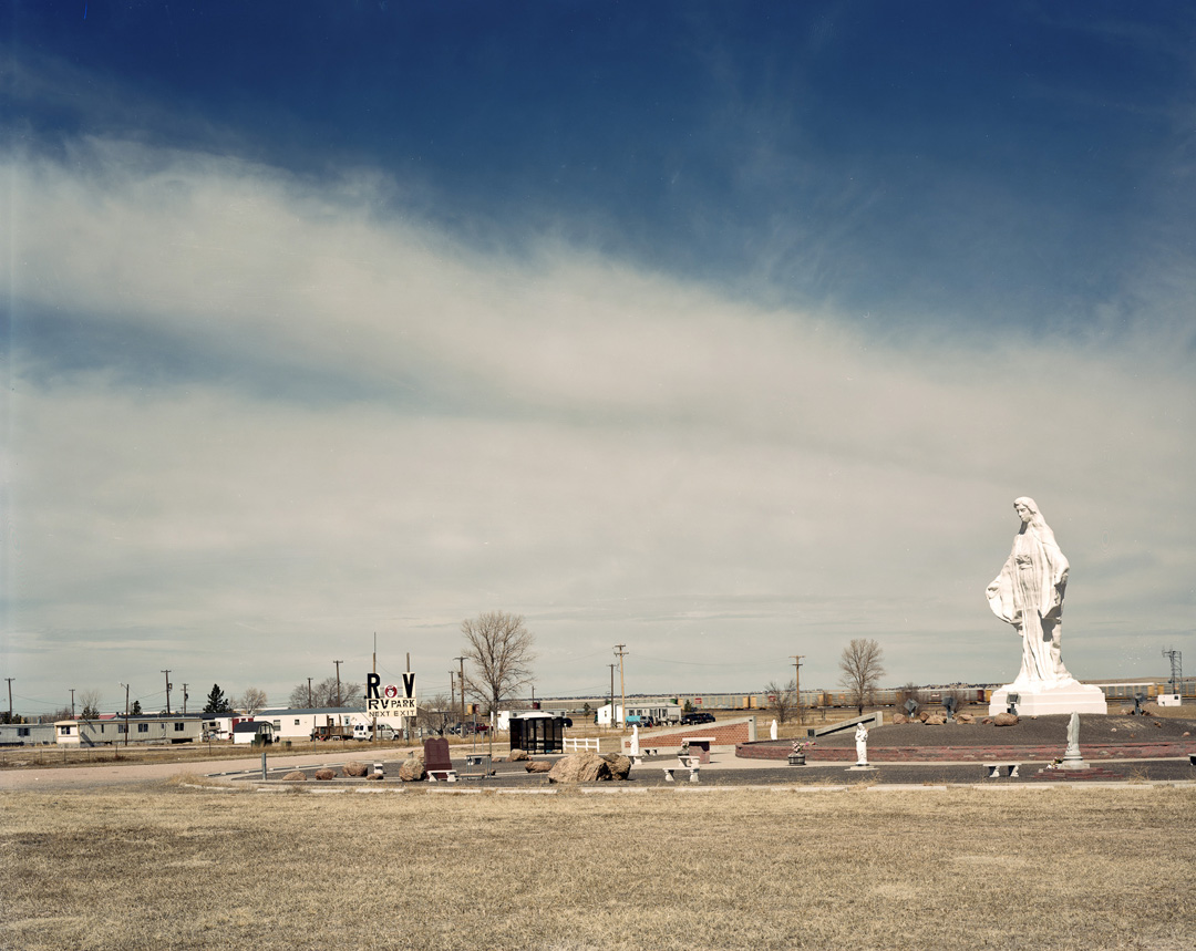
Jack Latham's 'Pink Flamingo' series, shot along the Oregon Trail earlier this year is also about a journey, but this time an actual road trip of 5000  miles.  During the course of one month he drove, parked up and photographed anything that he found interesting, from the familiar shopping mall 'parking lot' and fast food 'joints' to prayer gardens dominated by 30ft high models of the Virgin Mary.  His work is about the landscape and what man has done to it, but also is about the people he meets and what connects us all.  He's having a conversation with this part of America, and its a conversation which it is a pleasure to listen in on.  

Now, there is nothing new about this sort of project.  I am a big fan of Alec Soth's work and there were definitely echoes of Soth in Latham's project; the question is – could this actually be avoided when working in daylight on an American journey and shooting 10 x 8?  I need to be clear at this point – the comparison and observation are not criticisms as ultimately, for me, the image is the thing: if I like it/appreciate it/am intrigued by it, well I don't particularly mind if it looks as though it might have been made by one of my 'heroes'.  I haven't looked at Latham's work in enough depth and detail (it's hard to do this when images are presented as a powerpoint), but I think that there was a difference in tone between them and the work of Soth.  Maybe it was the muted palette in many of the images, or the distance between camera and subject...  I'll have to get back to you on this one.  Or even better, check out the work for yourself (link to website is at the bottom of the review.)

The most lively debate about the pictures concerned one of Latham's portraits.  Made of a woman and her small dog, the image showed the sign of a well known fast food chain in the background.  The woman was rather large and one inference that could be drawn from the composition was that her size was directly related to a liking for burgers and fries.  Latham was horrified by this – when making the photograph, his eyes were on the woman and her canine friend and he did not notice the sign with its negative cultural connotations behind.  He plans to remove the sign from the image when worked on digitally.  Although I understand his reservations – he doesn't want his subject to think he was 'making fun' of her, or that he was trying to make a statement about overweight Americans and their fast-food diet – I think he should leave the image as it is.  To remove the sign would take away a couple of layers of depth.


You can read more about Jack Latham in a previous le pub review:  http://fothphoto.blogspot.co.uk/2012/02/happy-valentines-day.html

Louise Hobson 's work has a particular and personal resonance for me: I am from forces stock.  Grandfather, father, two uncles, aunt, two cousins – all served or are serving in H.M. Forces.  I am an army brat.  I get a bit teary-eyed each time there is a 'Welcome Home' parade, or news of another fatality.  I just have to see a green uniform and I go all funny.  So, Hobson's work about her brother and his life in the Marines interested me very much.  
For those who haven't seen 'H Hour', this is not a piece of work designed to give us an impression of the everyday life of a soldier, in fact there isn't a single picture of a person anywhere within the set.  But Hobson does give a sense of the waiting and the preparation that goes on before troops are deployed to combat zones.  Her images lead us into the unfamiliar world of the training zones and she invites us to imagine how her brother and his colleagues interact within their environments.

Hobson's intention is to talk about the the journey her brother is making and it starts back at home.  We see a target built in the woods behind their family's house, a wall hanging in their kitchen detailing an idyllic village.  She then jumps to the impersonal details of a military bedroom before moving out into the training grounds themselves.  For me there is a problem with the suddenness of the shift: I needed more images about his connection to the family home in order to really appreciate his new experience and how different it is.  (We spoke about this at the end of the Le Pub session and this 'weakness' – my word and not hers – may be rectified in her final edit.)

The most successful images for me were the ones made on the gloomy days; the muted palette creates an atmosphere of calm and control and yet, of foreboding.  Something is going to happen in these spaces and it's going to be serious.  The square format holds the subject safe (does that sound a bit odd?)  I really like her choice of format and the way the images are composed.  I am less keen on the ones made in the mock up of the Afghan village.  Shot in harsh sunlight (appropriate I guess), they almost seem to have been made by a different photographer.  There is a brutality to many of them which is perhaps deliberate – after all, this is the true training ground for current conflicts.  Hobson's brother is due to be deployed to Afghanistan and on a subliminal level, perhaps she is expressing a strong reaction to this.  


Finally, we come to the phenomenon that is Tim Sayer.  In the history of the Documentary Course I am guessing that there has never been a student like him...  

But, where to start...  Probably at the end of the le pub night...  On the way home, I turned to one of my Italian guests (lovely students over from the Studio Marangoni in Florence) and asked what they thought of the night.  They loved it.  I asked which photographers they particularly liked and they told me.  Then I asked what they thought about Tim's work:

Me: So...  Urm...  What did you think of Tim's work.
A:  You can't call it work.
Me: Yes you can.  He works hard to make his pictures.  They are staged.  He makes props.  It
takes a long time to organise his shoots.  It is work.
A: So, he 'works hard', but he does not make work.

And this for me is one of the central issues when considering Sayer's output as a photographer.  I can see the effort he puts in, but like my Italian guests, I don't really appreciate the outcome.  

Taken singly, some of the images are actually very funny (the mother snorting coke from the belly of her baby is so wrong it is hilarious), but I just don't get the joke in many of them.  Without the narration that accompanied the images and powered the post-show discussion, they just don't make sense.  This is perhaps a reflection of my own naivety, but also highlights a real problem with the work – Sayer needs his viewers to have a certain level of background knowledge or experience to read the details within the image and appreciate fully what is going on.

The fundamental premise of the work and how it will be presented – as a series of greetings cards available on-line is pretty clever.  Ultimately, visitors to his website will be able to 'enjoy' cards that could be used to mark a range of occasions such as the birth of a child, or getting a new job.  Clicking on any of the 'cards' will then lead the viewer along to a new thread and a new project.  Choose a 'sweet sixteen' card, you will be led to a series of black and white large format nudes entitled, 'Decline of the Pubic Landscape' in which Sayer displays a variety of pubic barbering styles to comment on the deforestation of the Amazonian rain-forest.  Select 'With Deepest Sympathy' and you go to the 'Polishing a Turd' series.  Other cards will take you on alternative journeys into Sayer's imagination and view of the world.  For many people, the site will be a very interesting and engaging experience.

Sayer's aesthetic style is deliberately crude, which suits the images perfectly.  This is bad taste created by someone who really cares about it; there is no subtlety here.  In many of the images, the lighting is hard, aggressive and obviously artificial.  The 'I shot in 5 x 4 so it must be Art' Pubic Landscapes appear casually composed: we see crumpled clothes in the background which serve no purpose.  Even though the lower half of a naked woman is prone for the camera, there is nothing sexy, nor beautiful about the images.  If he's being truthful about the politics, then this is politics with no spin.  If he isn't, then the irony is cheap.

When I think that Sayer is just about to graduate, I wonder how on earth the tutors are going to mark his work.  I wouldn't like to be in their position.  When I consider his future, I imagine a series of novelty books to be sold at Christmas-time; cards purchased and passed on by blokes with a dodgy sense of humour and a career as a stand-up comedian with photography and photographers as his subject.  If he can fine tune his material, stripping out the jokes that are based on the most obvious photographic stereotypes, I can see the development of a unique comic act.  Coming soon to a comedy festival near you: Tim Sayer Polishing his Turds.


If you want to see more of the work (and I am sure that you will) check out the following:


Sam Laughlin:  http://samlaughlin.co.uk/


Jack Latham:  http://www.jacklatham.com/


Louise Hobson:  http://www.louisehobson.co.uk/


Ryan Grimley - site under construction.


Tim Sayer: Website is under construction.  But you can check out another Tim Sayer at:  http://www.independent.co.uk/life-style/art-im-tim-and-im-an-artoholic-1074303.html